AdBlock Detected!
Our website is made possible by displaying ads to our visitors. Please supporting us by whitelisting our website.
CSS Border-Radius Property |
|
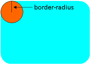
The CSS border-radius property is used to set "rounded corners" in an element. The values for this property can either be lengths or percentages. When a length is specified, it represents the length of the radius. When a percentage is specified, it represents the radius as a percentage of the element length. The picture below shows what border-radius represents in an element with rounded corners.
The border-radius property can take one to four values. Below is what each means:
In addition to the convention above, it is also possible to set the border radius for a specific corner. They are accomplished by the following four CSS properties:
For each corner, either one or two values can be defined. When only one value is used, the "rounded corner" looks like a circle. In other words, the x- and y-directions have the same radius. When two values are used, the rounded corner looks like an ellipse (see Example 5 below). Example 1: Specify a single value CSS Declaration
which results in the following: In Example 1, all four corners are rounded with a radius of 30px. Example 2: Specify two values CSS Declaration
which results in the following: In Example 2, the top-left and bottom-right corners have a radius of 30px, and the top-right and bottom-left corners have a radius of 50px. Example 3: Use percentages CSS Declaration
which results in the following: In Example 3, the radius is 50% of the element. Since the element is a square, the result of applying border-radius is a circle. If the element is a rectangle, the result would be an ellipse. Example 4: Specify each corner individually CSS Declaration
which results in the following: In Example 4, the radius is specified for the top-right, top-left, and bottom-left corners. Nothing is specified for the bottom-right corner, so it shows up as a right angle. Example 5: Set elliptical corners CSS Declaration
which results in the following: In Example 5, all four corners are set up as elliptical corners, and all have the same value: 20px for the radius along the x-axis, and 60px for the radius along the y-axis. Example 6: Set multiple elliptical corners CSS Declaration
which results in the following: In Example 6, the top-left and bottom-right corners have a radius of 20px/60px, while the top-right and bottom-left corners have a radius of 40px/20px. Note that in this case, it is incorrect to specify "border-radius:20px/60px 40px/20px." |
Our website is made possible by displaying ads to our visitors. Please supporting us by whitelisting our website.